
 75Likes
 LinkBack URL
 About LinkBacks
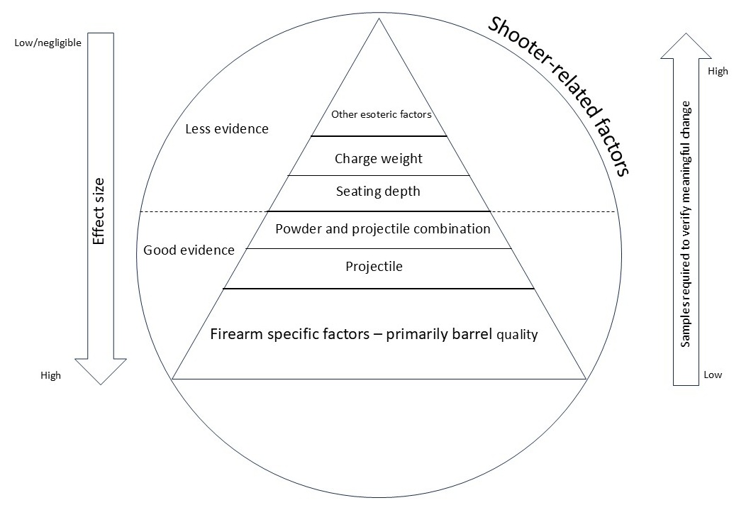
Prompted by discussion on another thread, I got to pondering if there was a way to visually represent the primary variables we typically play with when it comes to reloading and precision. After input from a couple of members, I updated my first attempt and have posted below.
It's not intended as a flow-chart or 'how to' of reloading, but at least suggests where you might get the best 'bang for your buck' when trying to increase precision. I also acknowledge that there will be different perspectives on the relative importance of different variables, however I've based my thoughts on my understanding of the data coming out of large sample testing discussed by Hornady/Litz et.al.
More than happy to be corrected here - I just like diagrams to help me understand concepts, and maybe someone else will find it useful.
Welcome guest, is this your first visit? Create Account now to join.
Welcome to the NZ Hunting and Shooting Forums.
Search Forums


User Tag List
Results 1 to 15 of 70
Thread: Variables affecting precision
Threaded View
-
08-07-2025, 01:37 PM #1Member

- Join Date
- Dec 2024
- Location
- Manawatu
- Posts
- 297
Variables affecting precision


 Reply With Quote
Similar Threads
-
Old Ammo Affecting Rifle Accuracy?
By Copelli in forum Firearms, Optics and AccessoriesReplies: 7Last Post: 11-05-2024, 12:31 AM -
WTB: 7mm rem mag Precision die set
By Hubt.nz in forum Reloading and BallisticsReplies: 0Last Post: 10-05-2020, 08:53 AM -
Bipod affecting accuracy.
By Finnwolf in forum Reloading and BallisticsReplies: 33Last Post: 24-08-2019, 05:33 PM -
Shooter variables
By Cartman in forum ShootingReplies: 16Last Post: 14-11-2015, 09:57 PM
Tags for this Thread
 Posting Permissions
- You may not post new threads
- You may not post replies
- You may not post attachments
- You may not edit your posts
Welcome to NZ Hunting and Shooting Forums! We see you're new here, or arn't logged in. Create an account, and Login for full access including our FREE BUY and SELL section Register NOW!!
All times are GMT +13. The time now is 06:58 AM.

Bookmarks